9 Types of graphs in the npde library
9.1 Plot type
The plot.type argument can be used to control the type of plot needed. The following table shows the available plot types:
| Plot type | Description |
|---|---|
| data | Plots the observed data in the dataset |
| x.scatter | Scatterplot of the versus the predictor X (optionally can plot or instead) |
| pred.scatter | Scatterplot of the versus the population predicted values |
| cov.scatter | Scatterplot of the versus covariates |
| covariates | represented as boxplots for each covariate category |
| vpc | Plots a Visual Predictive Check |
| loq | Plots the probability for an observation to be BQL, versus the predictor X |
| ecdf | Empirical distribution function of the (optionally or ) |
| hist | Histogram of the (optionally or ) |
| qqplot | QQ-plot of the versus its theoretical distribution (optionally or ) |
| cov.x.scatter | Scatterplot of the versus the predictor X (optionally can plot or instead), split by covariate category |
| cov.pred.scatter | Scatterplot of the versus the population predicted values, split by covariate category |
| cov.hist | Histogram of the , split by covariate category |
| cov.ecdf | Empirical distribution function of the , split by covariate category |
| cov.qqplot | QQ-plot of the , split by covariate category |
\[tab:plot.type\]
By default these graphs are produced for npd, but the which argument can be used to change that behaviour. For instance, the following code will show scatterplots of npde versus the independent covariate:
plot(myres, plot.type="x.scatter", which="npde")9.1.0.1 Application to theophylline
Data:
plot( y, plot.type = "data" )## Selected plot type: data## Warning: Removed 12 rows containing missing values (geom_point).## Warning: Removed 12 row(s) containing missing values (geom_path).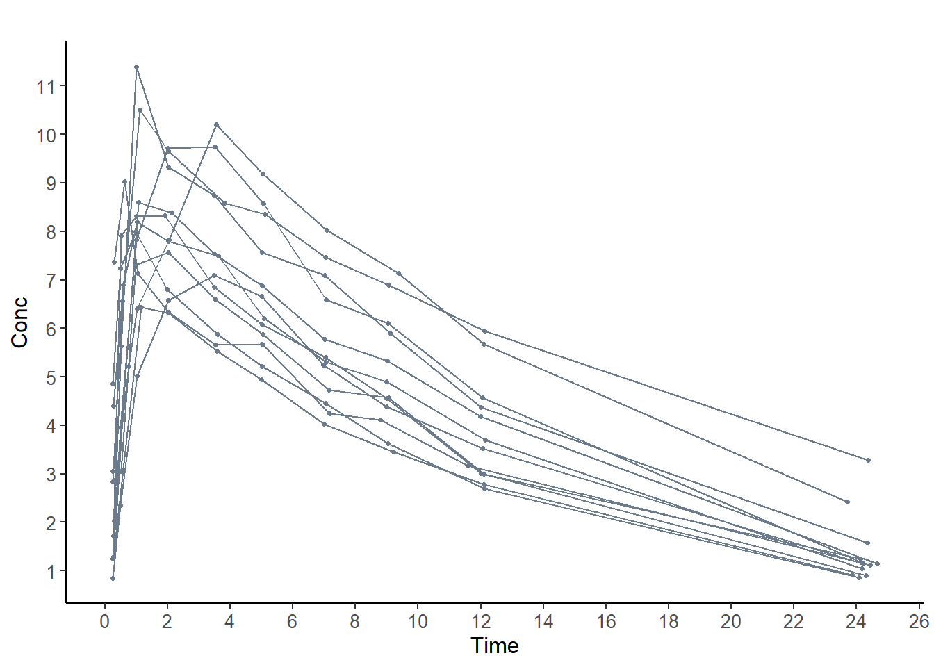
9.2 Specific plot functions
All the plot types above can also be accessed through their individual plot functions, given in the last column of the table above. Individual help functions are available to detail how to use each function.
9.2.1 Binning
Most graphs now have the option of adding prediction intervals. These prediction intervals are computed using simulations under the model, and they require a binning algorithm. The influence of the number and position of bins is quite important for the visual assessment of the fit.
Several options are available for binning, and can be set using the vpc.method option. Possible options are:
equal: uses quantiles of the data to have about the same number of points in each binwidth: divides the interval into bins of equal sizeuser: user-defined breakpoints, set invpc.breaks(will automatically be expanded to include the lower and upper value of the data if not provided) (ifvpc.breaksis not supplied, theequalmethod will be used instead)optimal: uses theMclustfunction from themclustlibrary (when available) to provide the optimal clustering; the Mclust method
With all methods, if the number of bins requested is larger than the number of unique values of X, the number of bins will be limited to the number of unique values.
Warning
When using the ‘optimal’ method, warnings may appear. The optimal number of bins is selected from a range equal to vpc.bin \(\pm 5\), but a message such as:In map(out$z) : no assignment to usually indicates that the number of bins is too large, it is then advised to change the value of vpc.bin and start again.
Specifying c(0.01,0.99) with the equal or width binning method and vpc.bin=10 will create 2 extreme bands containing 1% of the data on the X-interval, then divide the region within the two bands into the remaining 8 intervals each containing the same number of data; in this case the intervals will all be equal except for the two extreme intervals, the size of which is fixed by the user; complete fine-tuning can be obtained by setting the breaks with the vpc.method=“user”